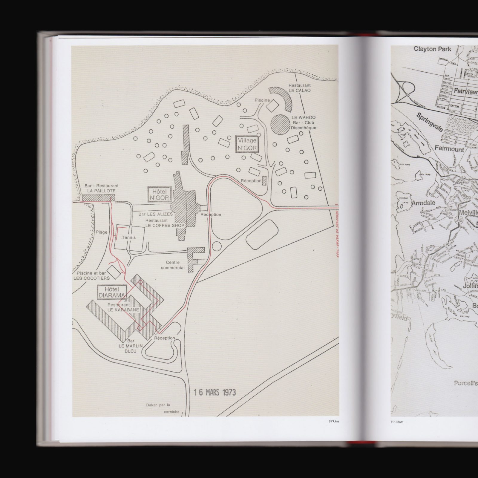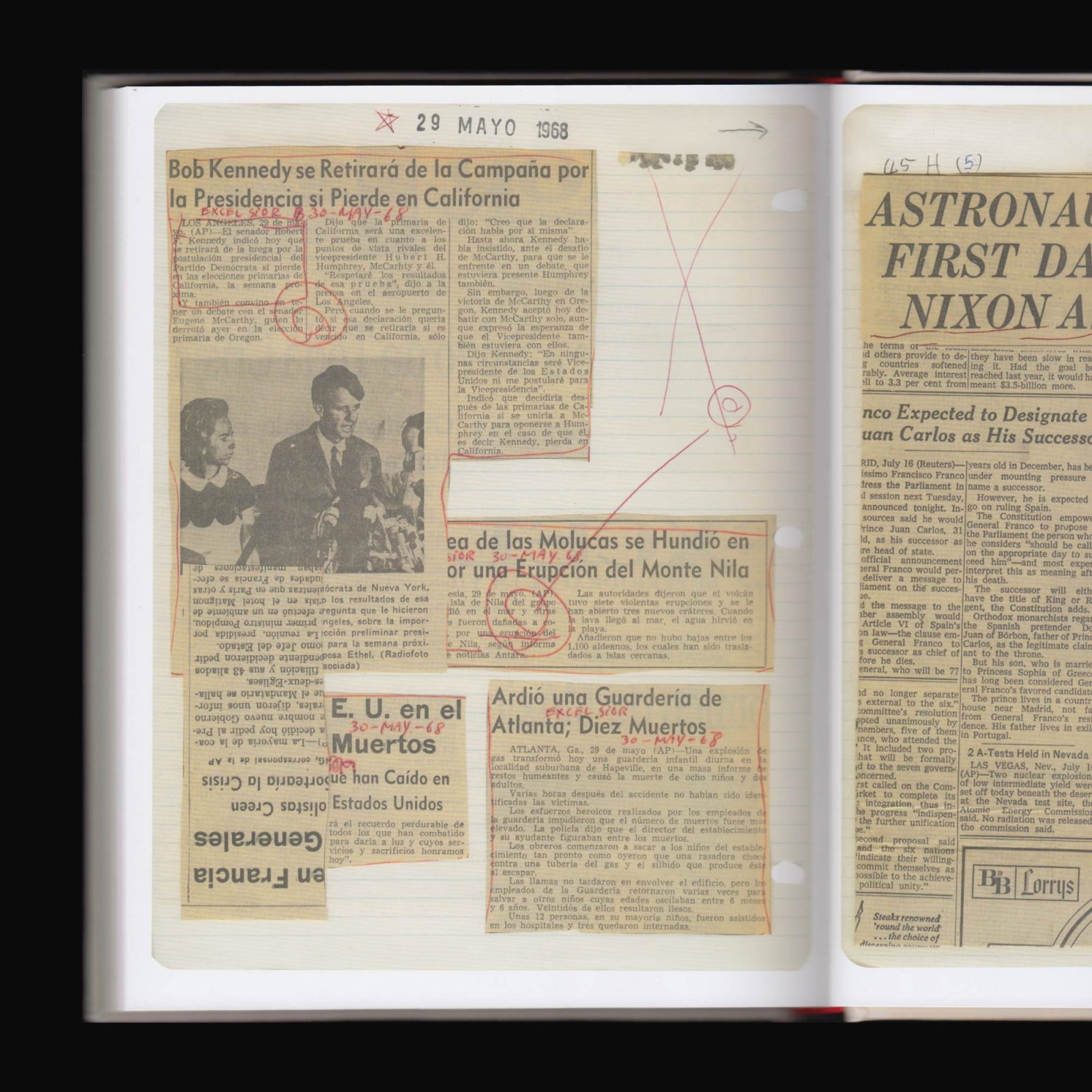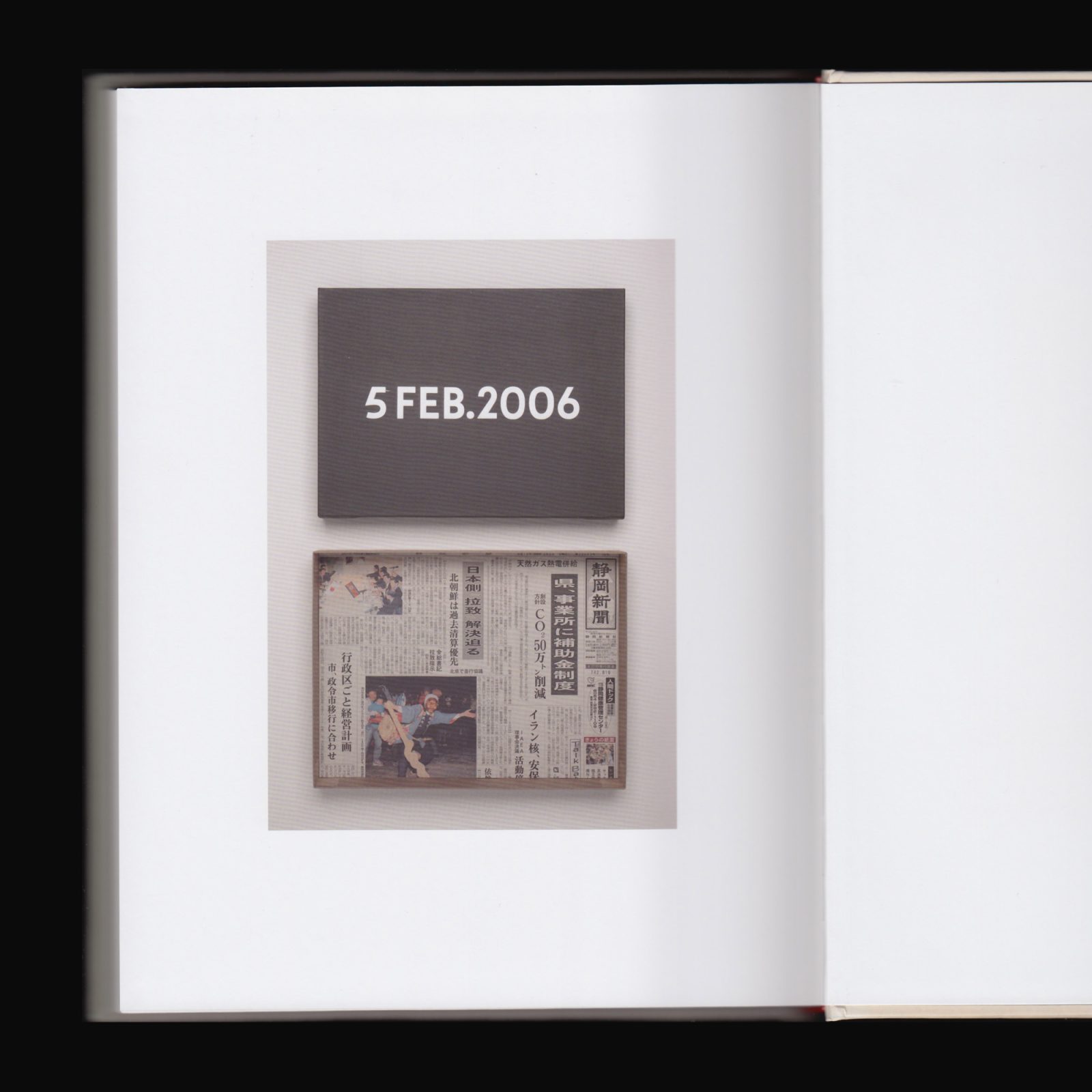
Works In Situ, A Work In Situ
Published by Galerie Rüdiger Schöttle, Munich, 2008, unpaginated (colour & b/w ill.), 20 × 22.7 cm, English
Price: €18
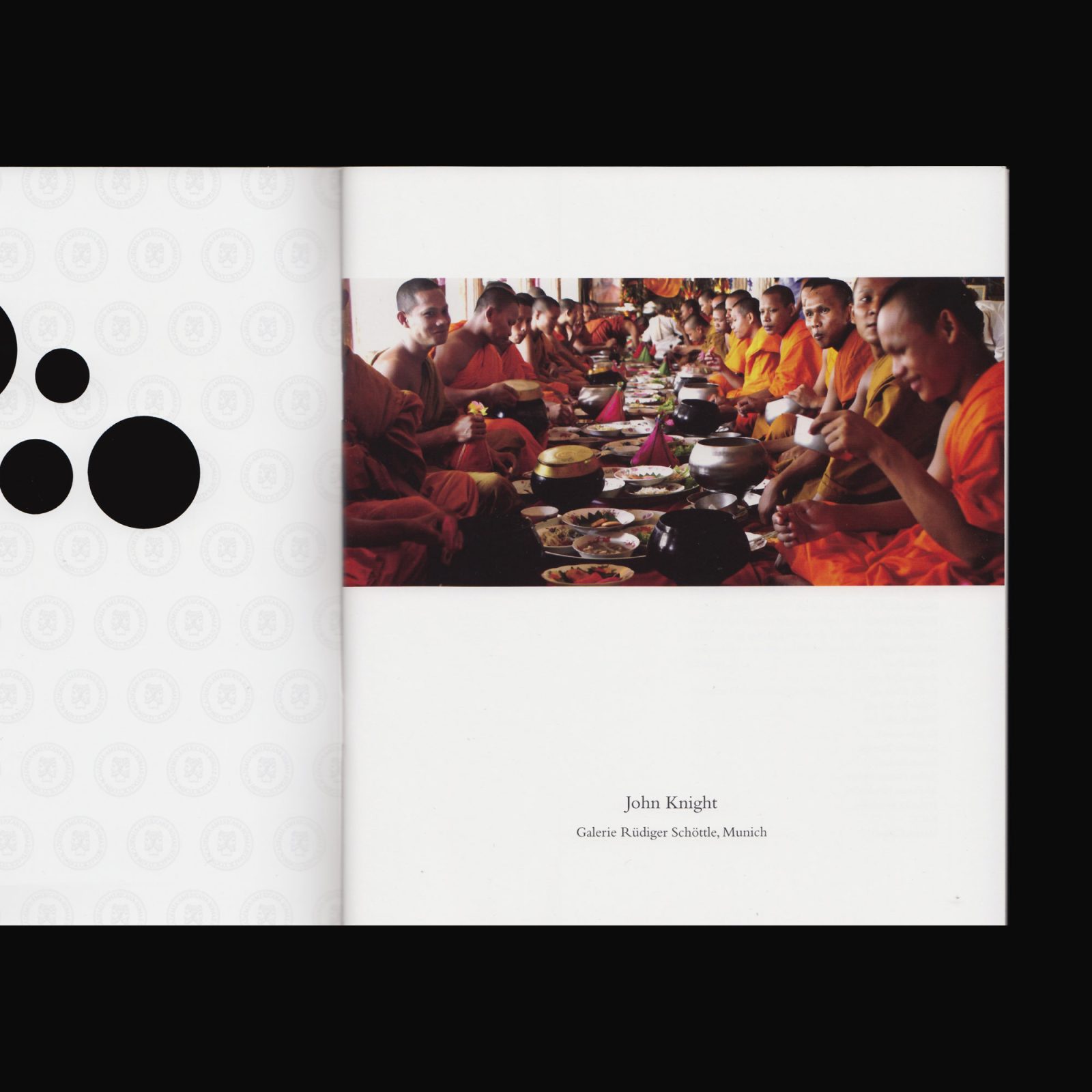
Produced on the occasion of the exhibition John Knight WORKS IN SITU, A WORK IN SITU at Galerie Rüdiger Schöttle, Munich, 19 April–17 May, 2008.