BILD, oder
Published by Badischer Kunstverein, Karlsruhe, 2004, 380 pp. (b/w ill.), 25.5 × 36 cm, English
Price: €80
Produced on the occasion of Joëlle Tuerlinckx and Willem Oorebeek’s exhibition Mit einem Fuß in der Realität at the Badischer Kunstverein, Karlsruhe, 11 April–9 May, 2004.
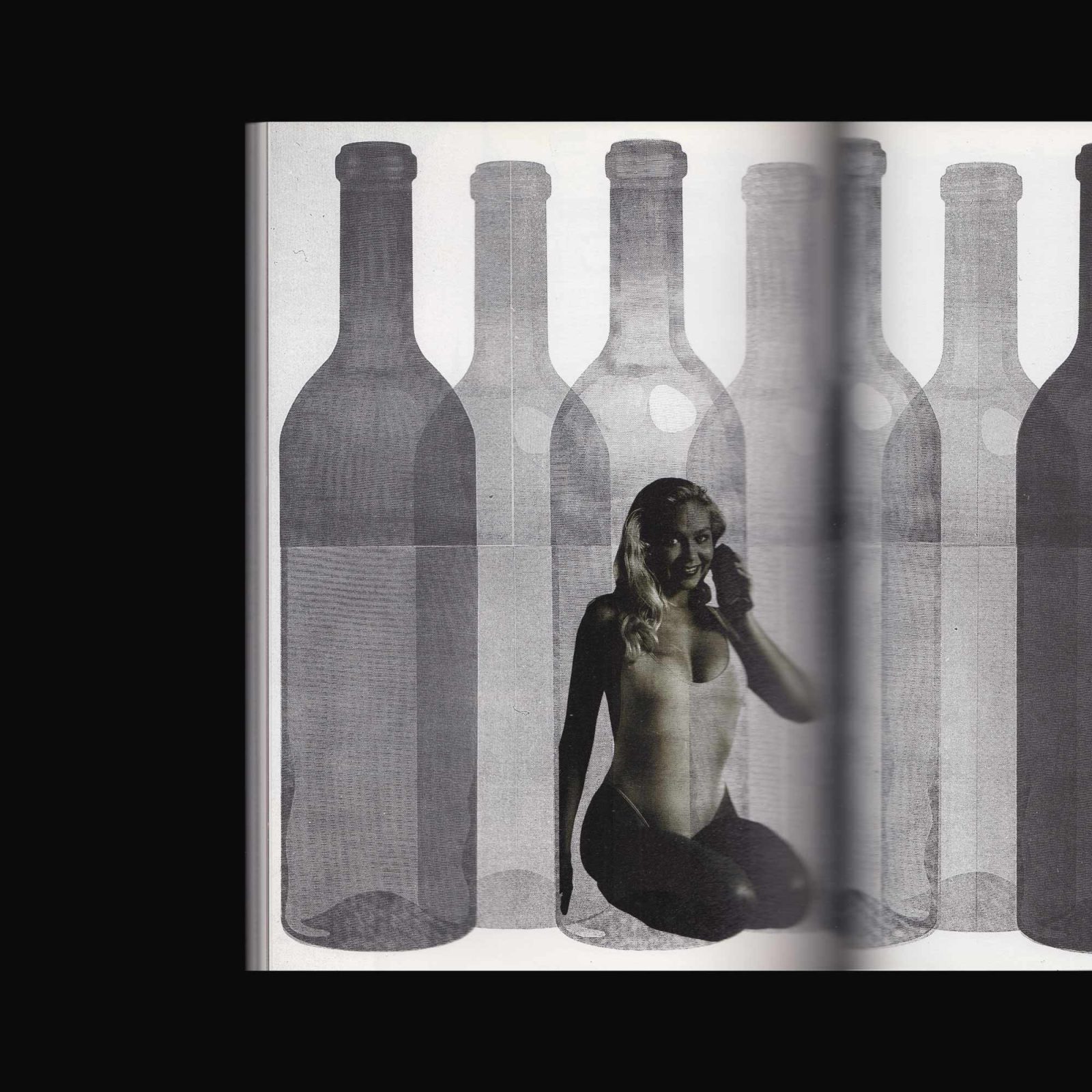
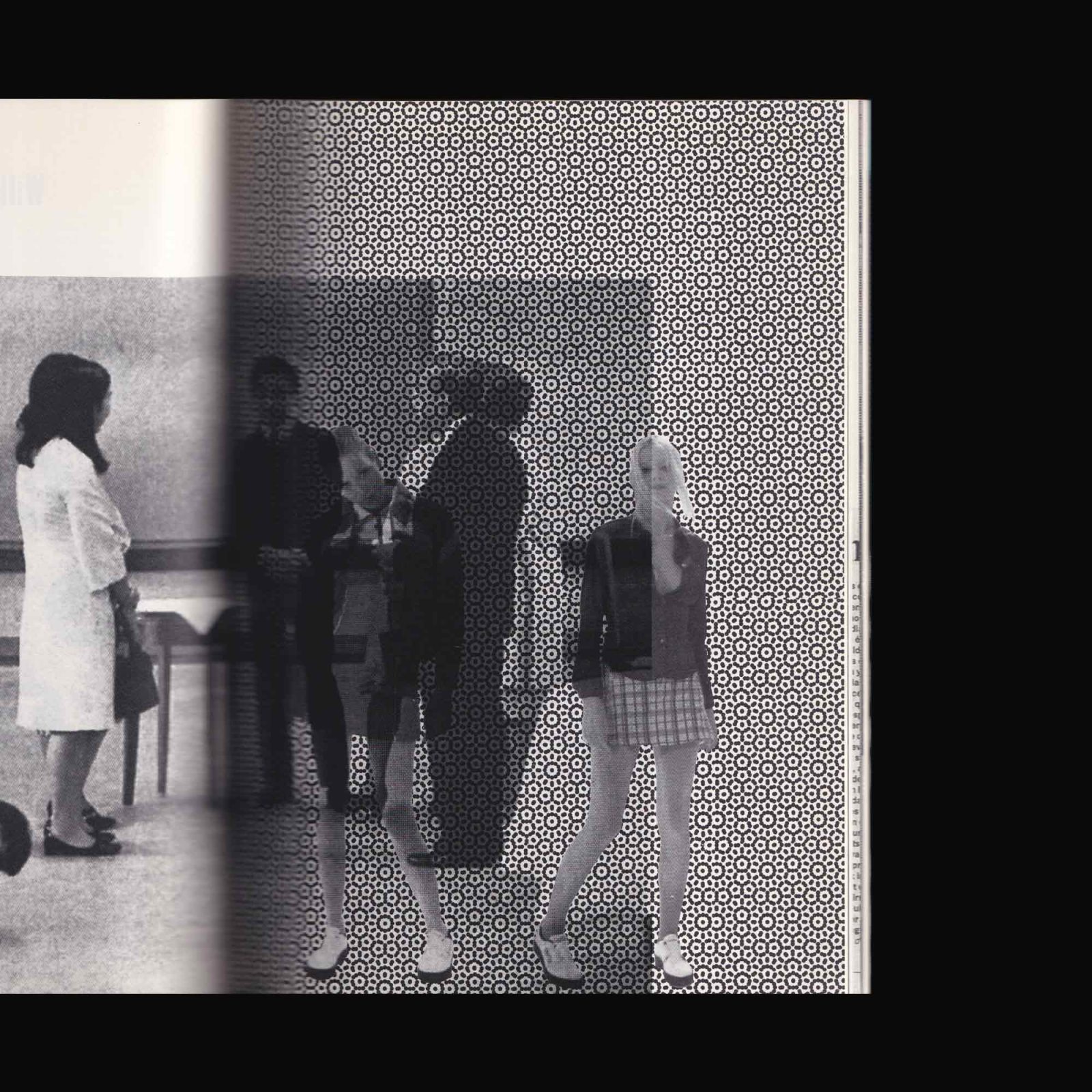
The energy of BILD, oder comes from the associative dialogue between the two artists and the pooling of their respective archives: their own works, working notes, scraps, newspapers, posters, and other various sources preserved for various reasons. This accumulation of traces from their daily practice punctuates the flow of time.