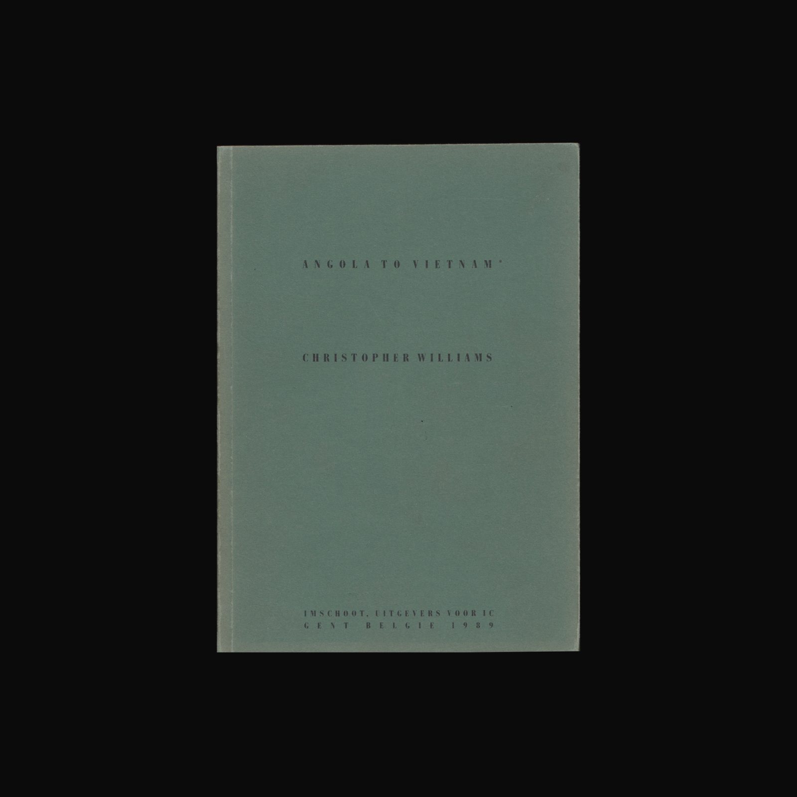
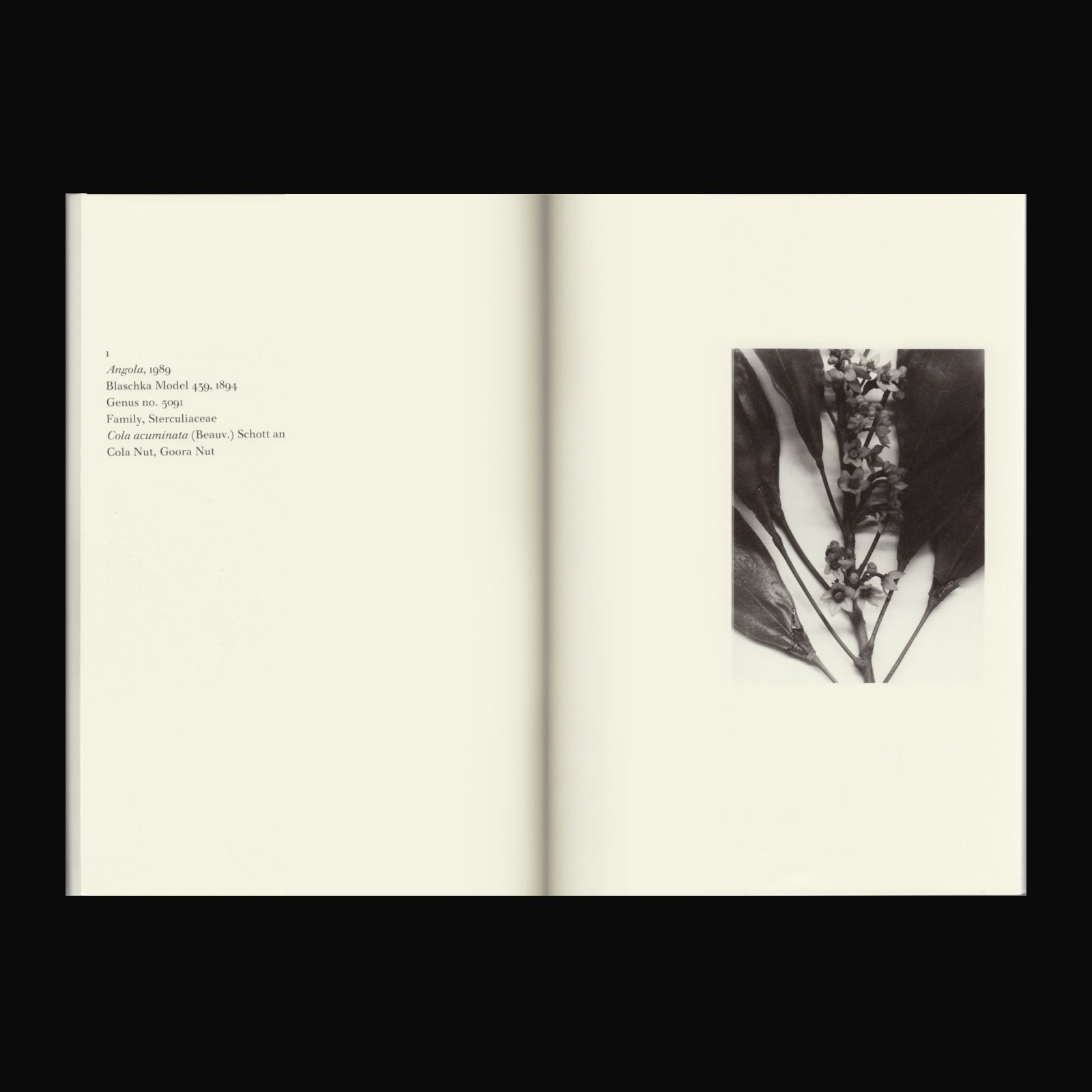
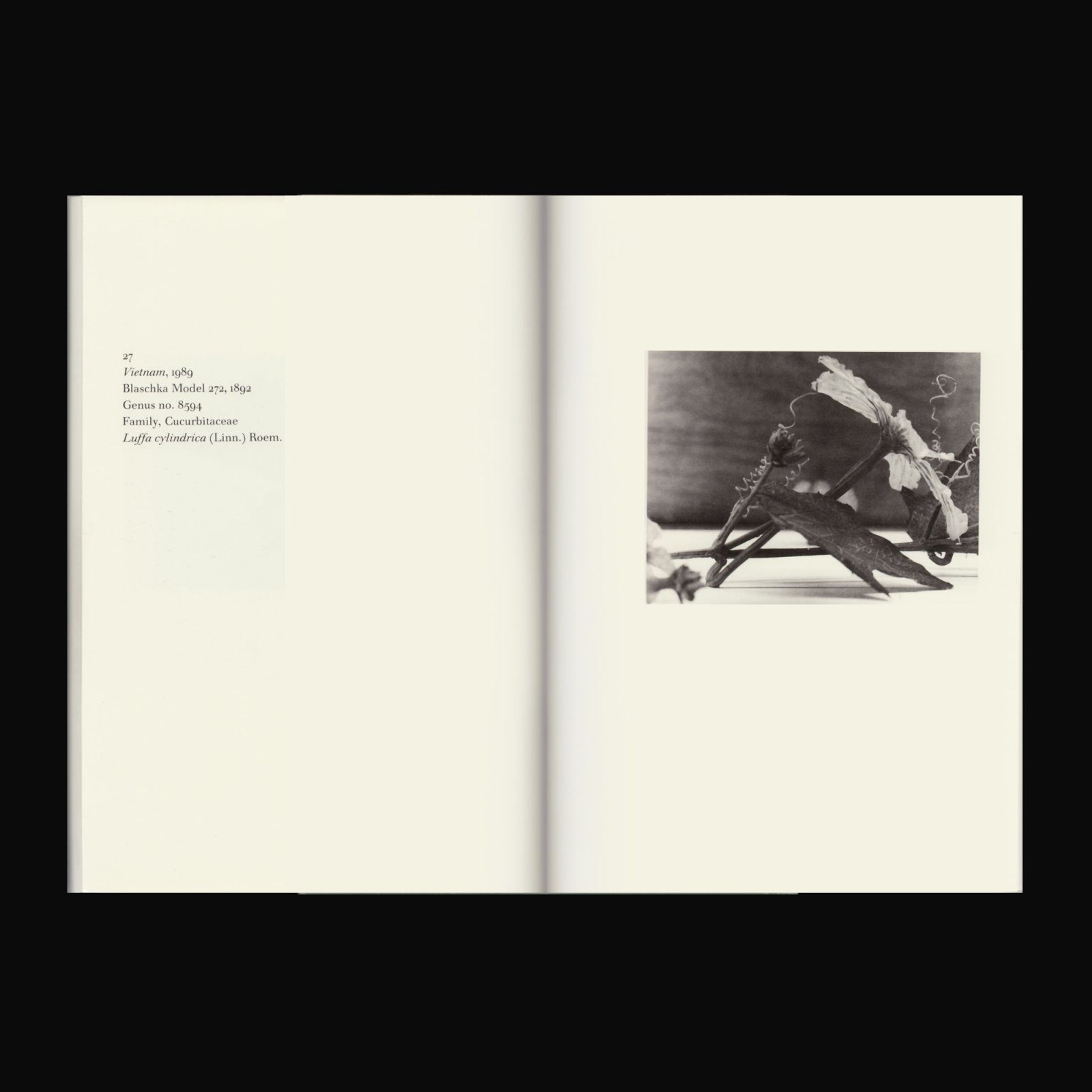
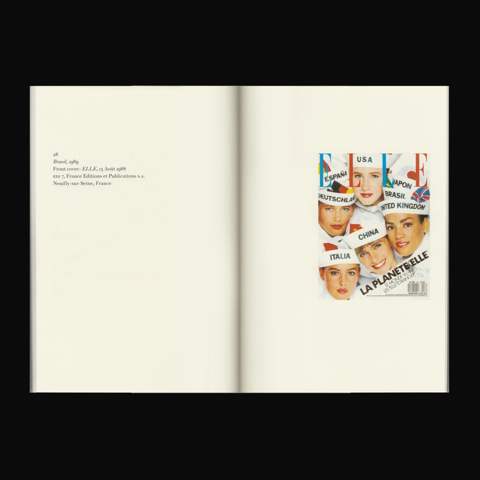
Angola to Vietnam is Christopher William’s 1989 artist’s book based on his photographic piece of the same title featuring twenty-seven images of glass flowers from Harvard University’s Peabody Museum of Natural History. “Drawing from the Peabody’s cache of sculptural specimens, Christopher Williams selected only those plants native to countries in which state-sponsored murders occurred in 1984. The information affixed to each photograph mimics the museum’s labels, but here Williams places the country of origin above the flower’s Latin name, subtly foregrounding the political over the natural. By referencing government-sanctioned atrocities, Williams calls attention to the flowers’ colonial origins, as the science of botany is rooted in the tangled and often exploitative history of international exploration and trade”.

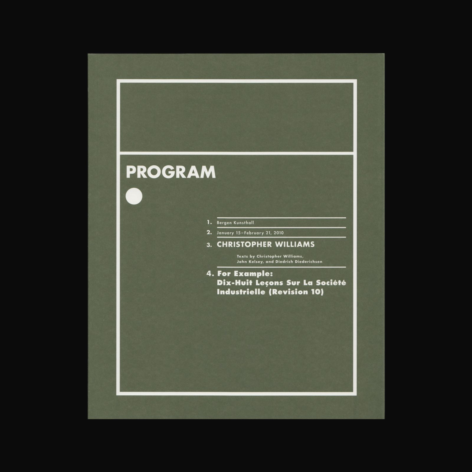

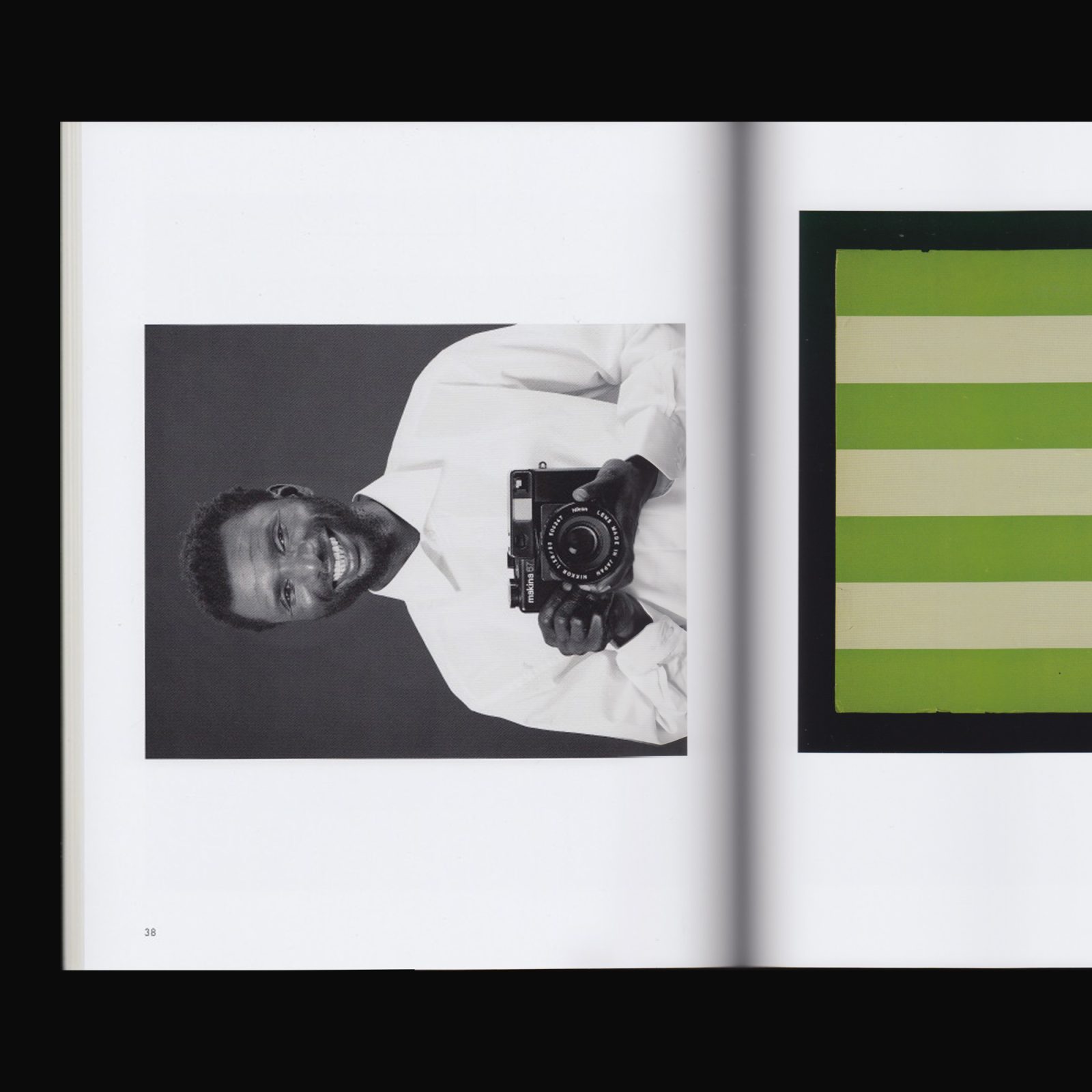
Program was produced by Bergen Kunsthall on the occasion of the exhibition For Example: Dix-Huit Leçons Sur La Société Industrielle (Revision 10), curated by Solveig Ovstebo. With texts by Solveig Øvstebø, Diedrich Diederichsen, John Kelsey, and Christopher Williams, and design by Christopher Williams and Petra Hollenbach.
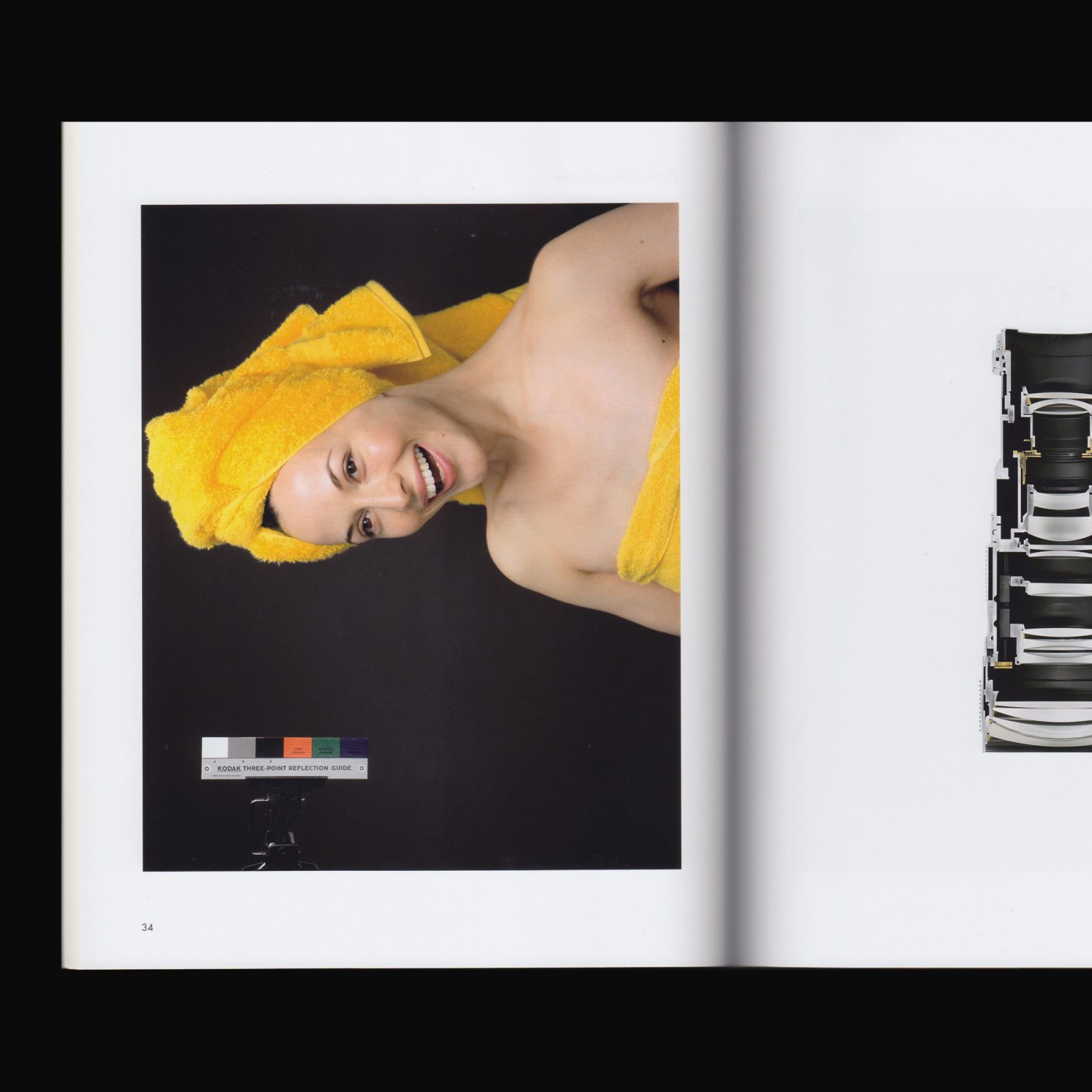
Christopher Williams’ work operates within the conventions of advertising, the superficiality of surface, and, ultimately the history of Modernism. In photography, film, performance, sculpture, graphic design, and video, the process of reproduction is the artist’s point of entry; from there he exposes the flaws in a near-perfect, carefully constructed reality. Each image, whether architectural or figurative, natural or manufactured, is subject to the conditions of production and the inevitable boundaries of the pictorial surface.
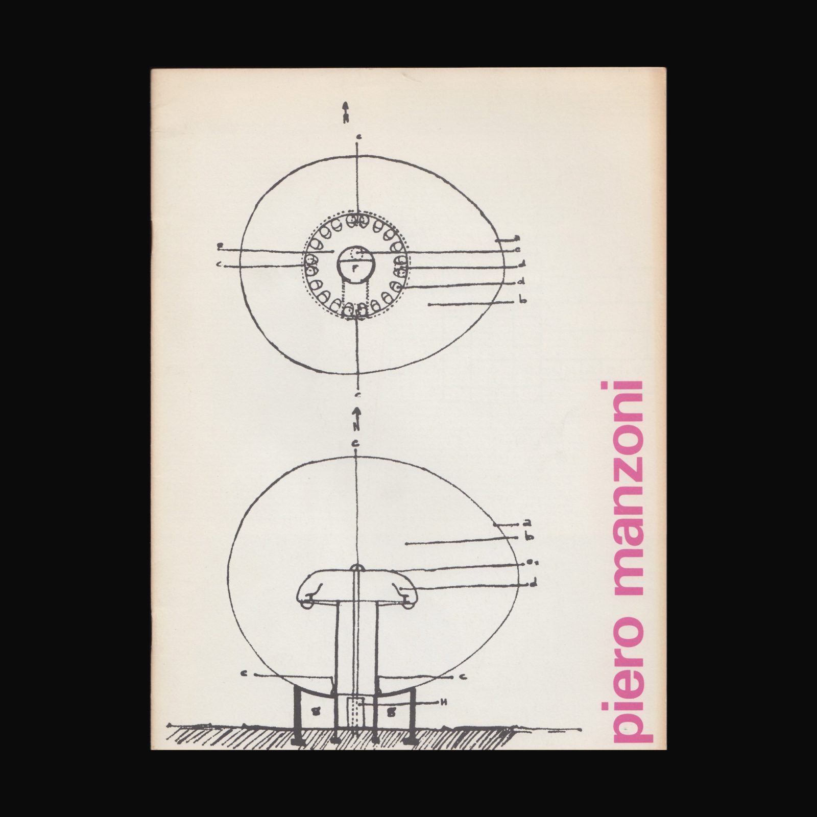
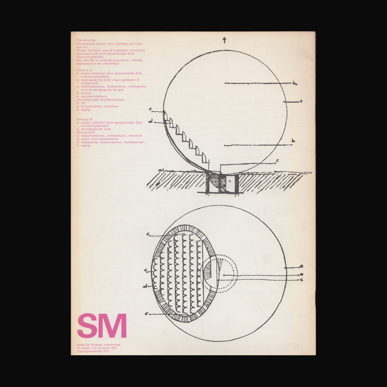
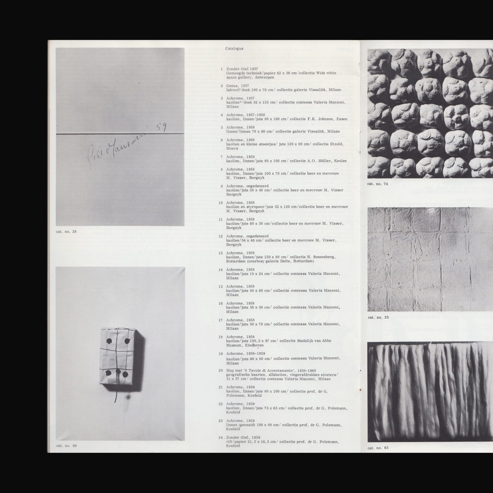
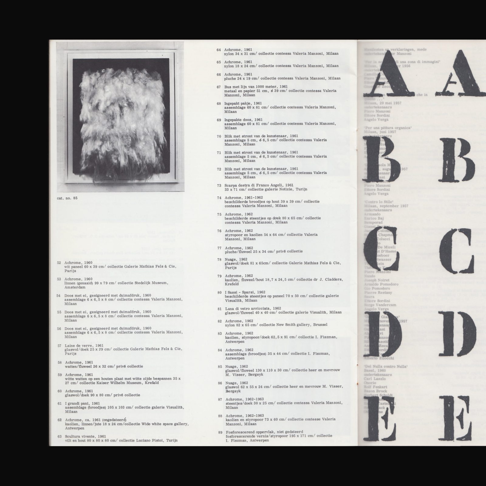
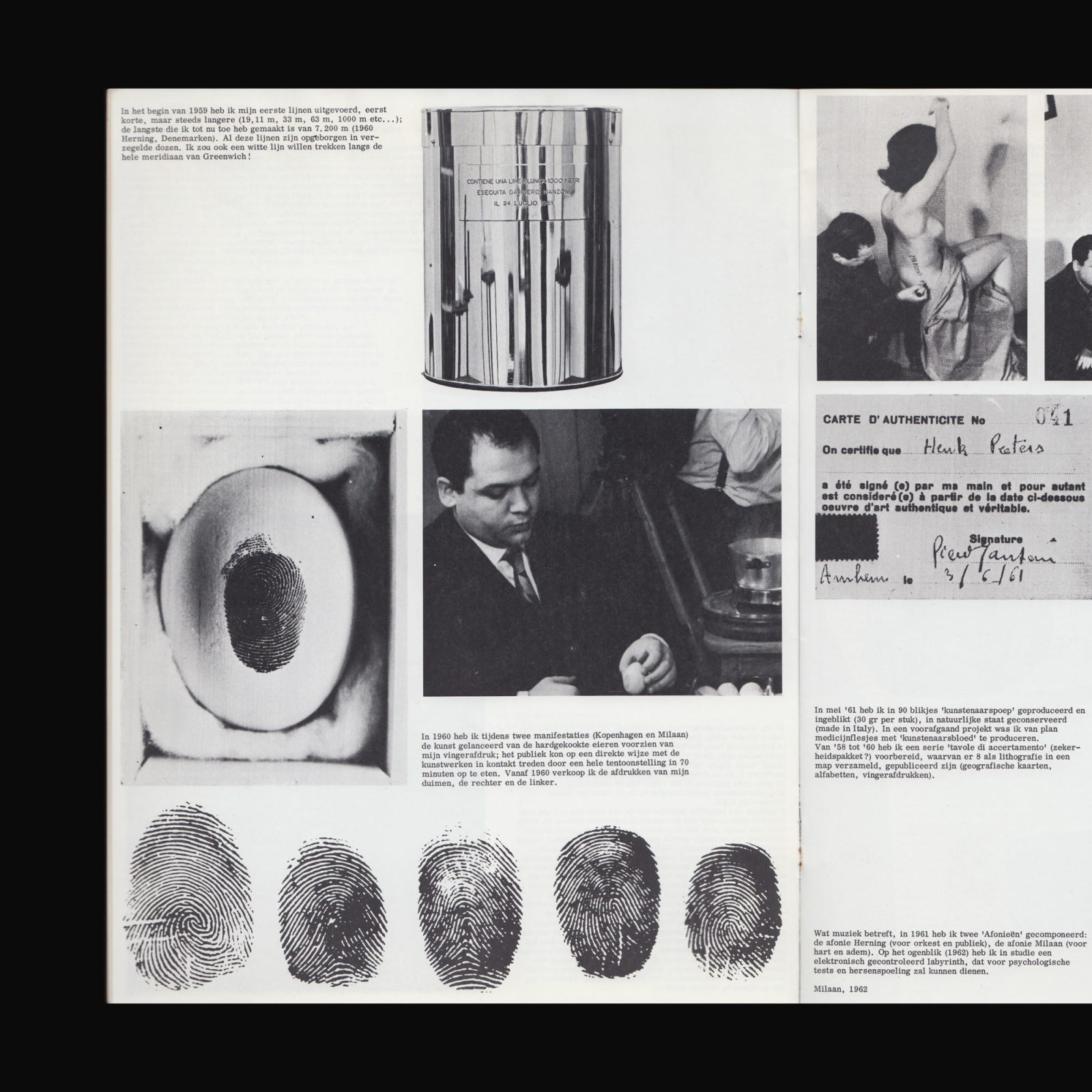
Produced on the occasion of the exhibition Piero Manzoni at the Stedelijk Museum, Amsterdam, 13 March–26 April, 1970.
SM Cat. No 474.
Designed by Wim Crouwel.
*Please note this publication is secondhand and has some traces of previous ownership.
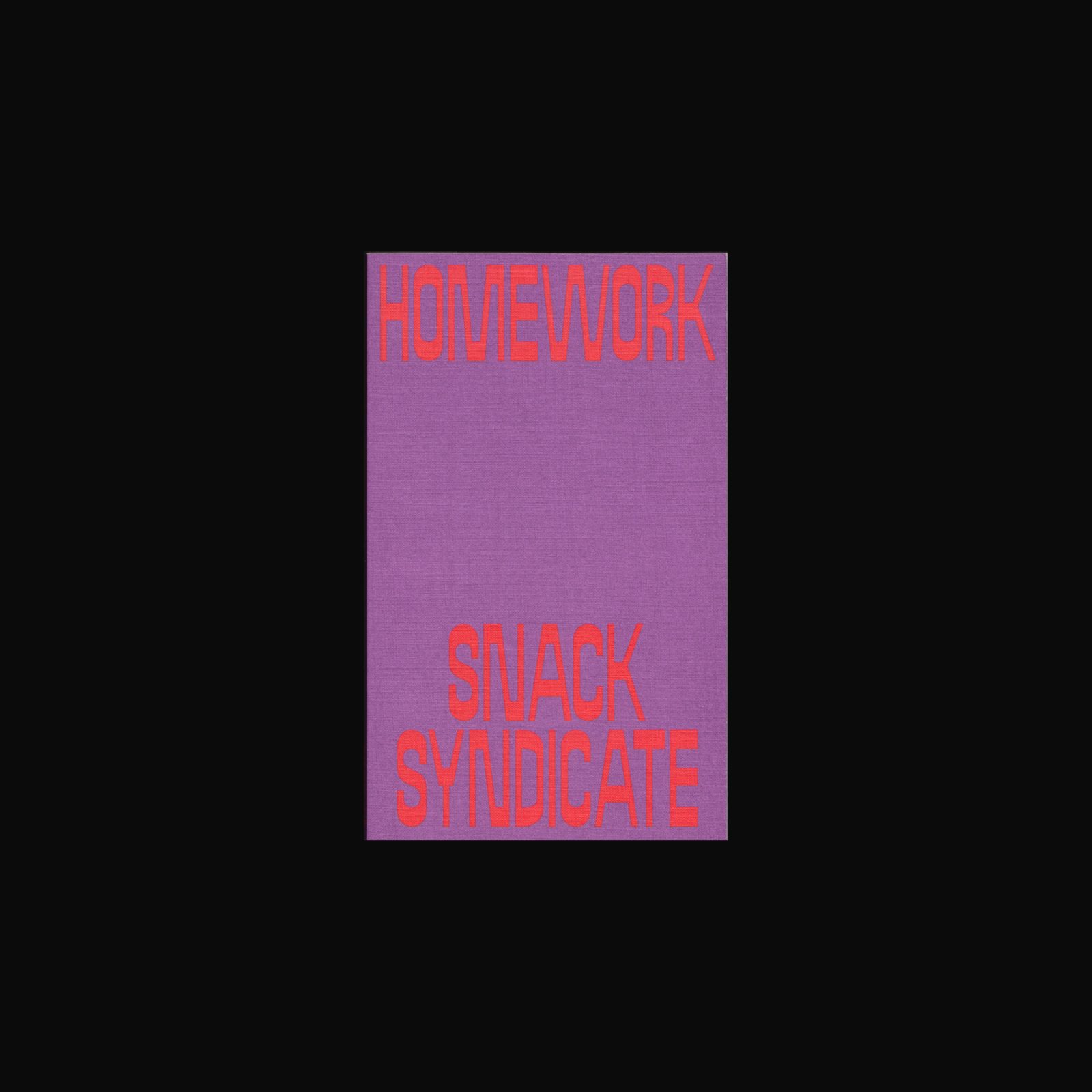

Homework by Snack Syndicate (Andrew Brooks & Astrid Lorange) collects twenty-seven texts written over the course of 2016–2020. Homework considers the manifold ways that embodied life (birth, death, love, friendship, solidarity, race, gender, sexuality, citizenship) are conditioned by a world that appears both ruinous and full of potential. Snack Syndicate asks how to read ruins and how to read the prophecy of hope that threads together a long history of survival and struggle. The book offers a guide for this reading, taking study to be a lifelong practice. It suggests a model for homework as the promise we make to each other through study and to the ghosts who carry us forward.
Introduction by Tom Melick and designed by Robert Milne.
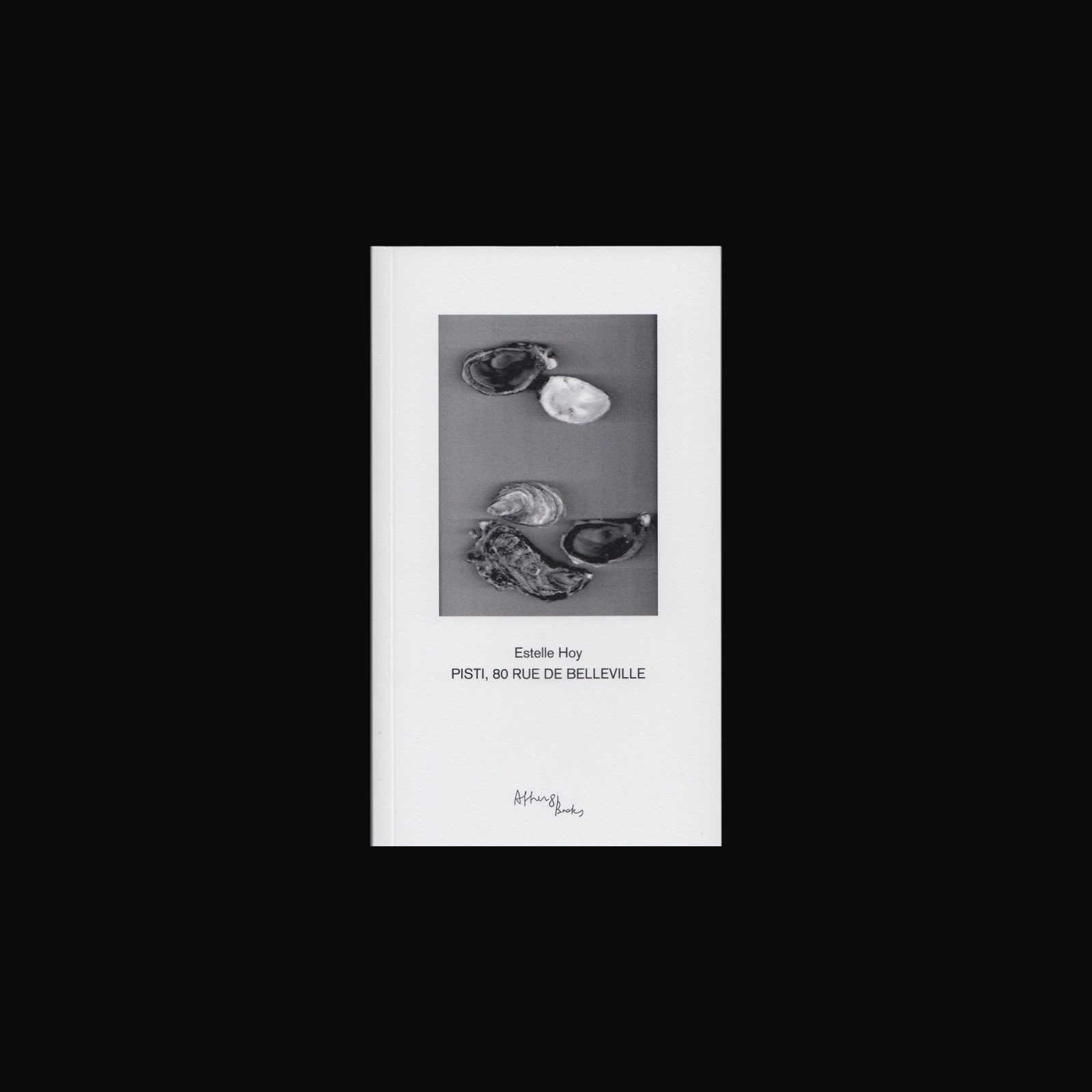

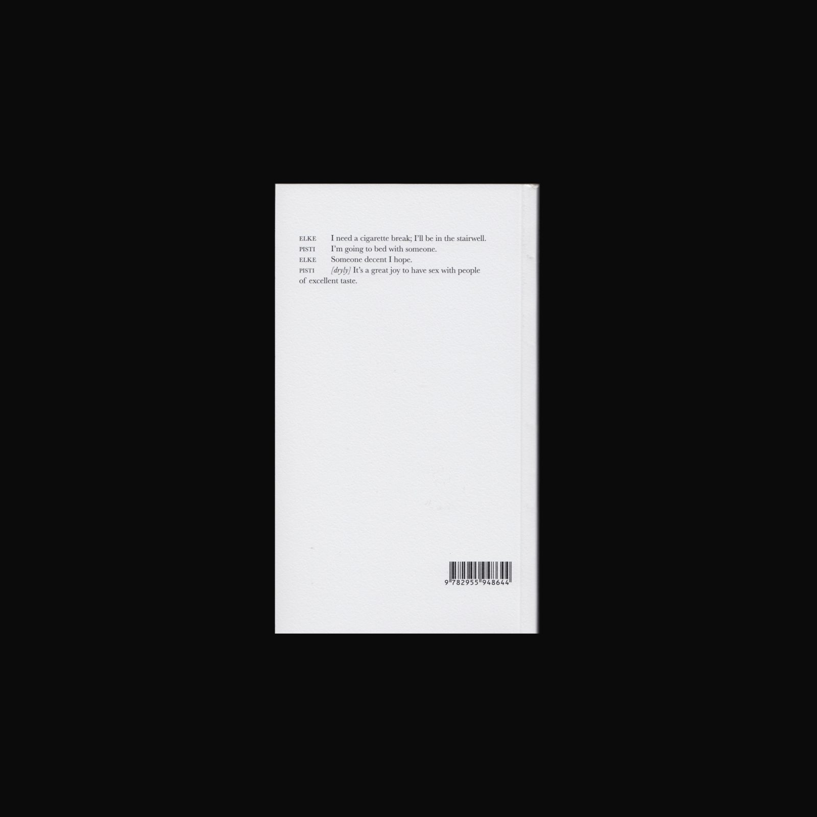
Estelle Hoy offers a wry exploration of the seductive allure of tropes and cliché in the art world and politics in this novella, which documents the story of Pisti, a leftist Hungarian activist and her anarchist collective based in Paris. In the course of one night in a Belleville apartment, old friends and new lovers converse about contemporary politics, activism and art, violence, and queer issues. The book is also an experiment in writing, teasing the reader with namedropping and appropriation. Whole phrases are lifted from other texts and woven seamlessly into the narrative. Based in Berlin and Paris, Hoy is a feminist writer, socially engaged artist, political activist, and academic.
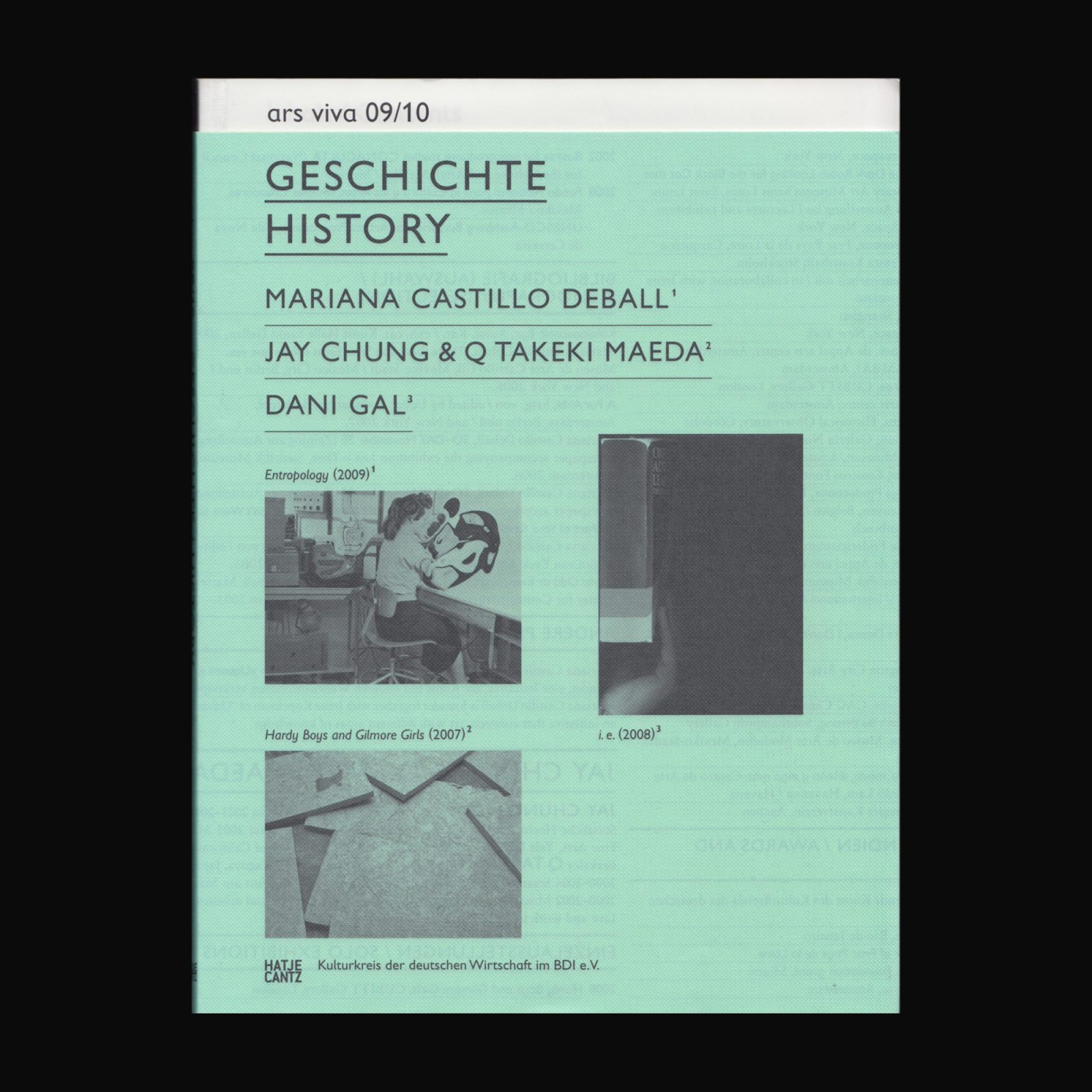

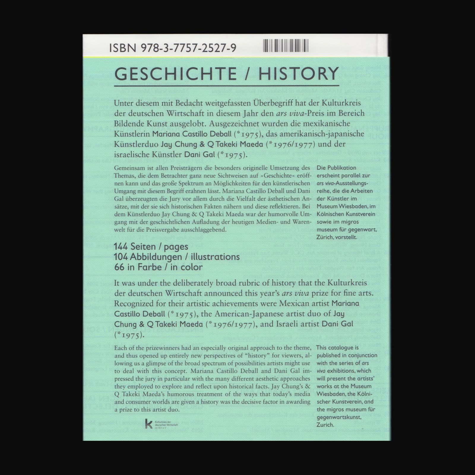
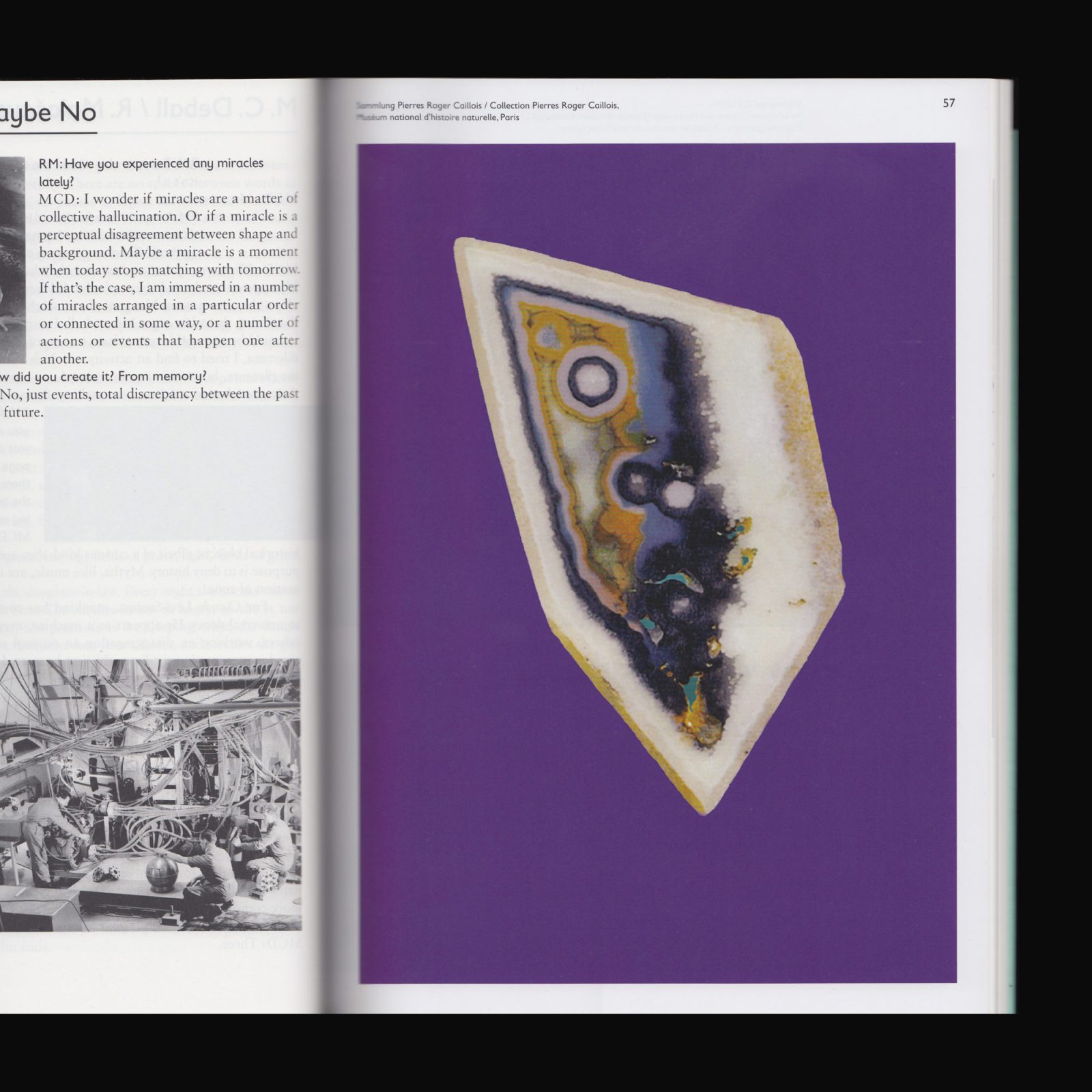
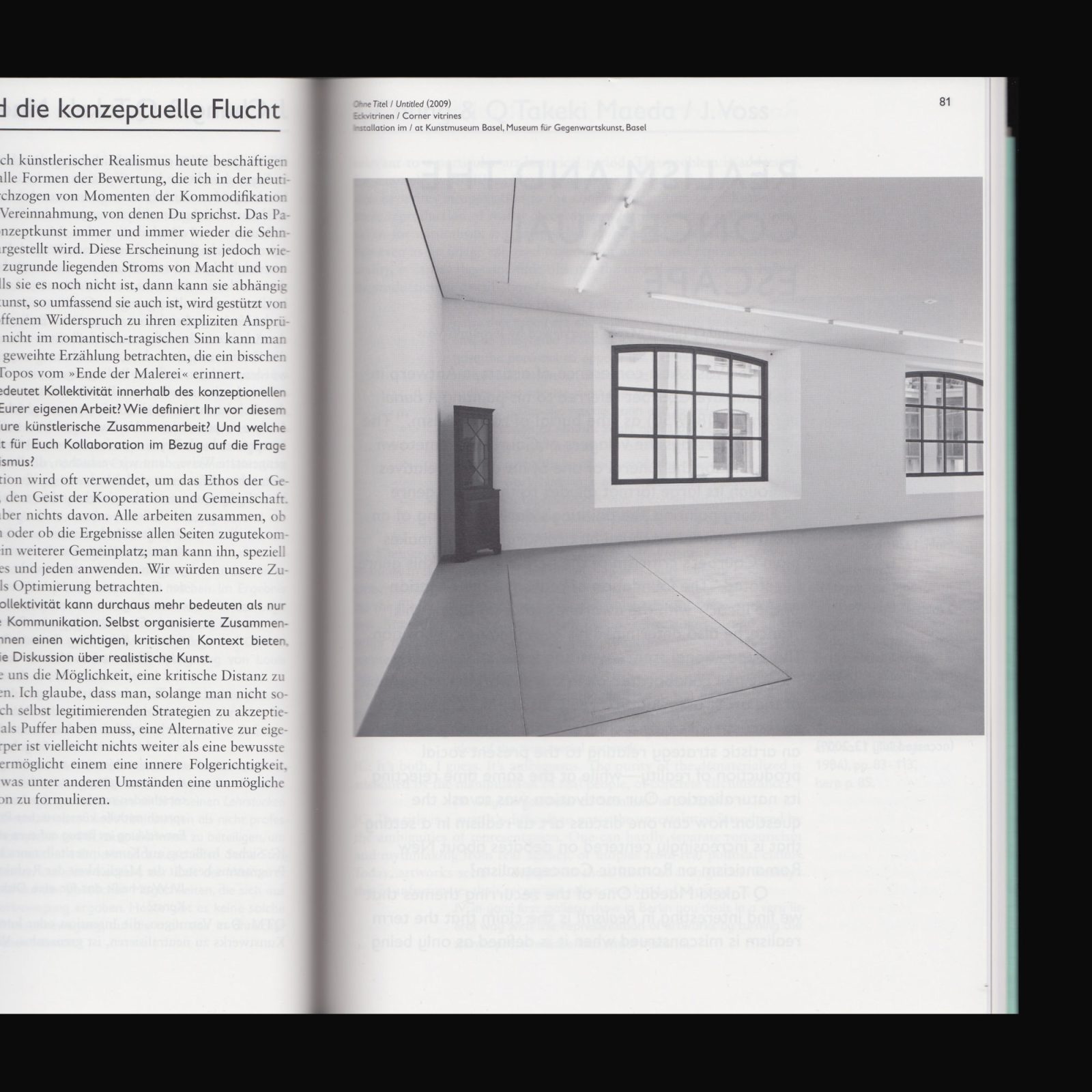
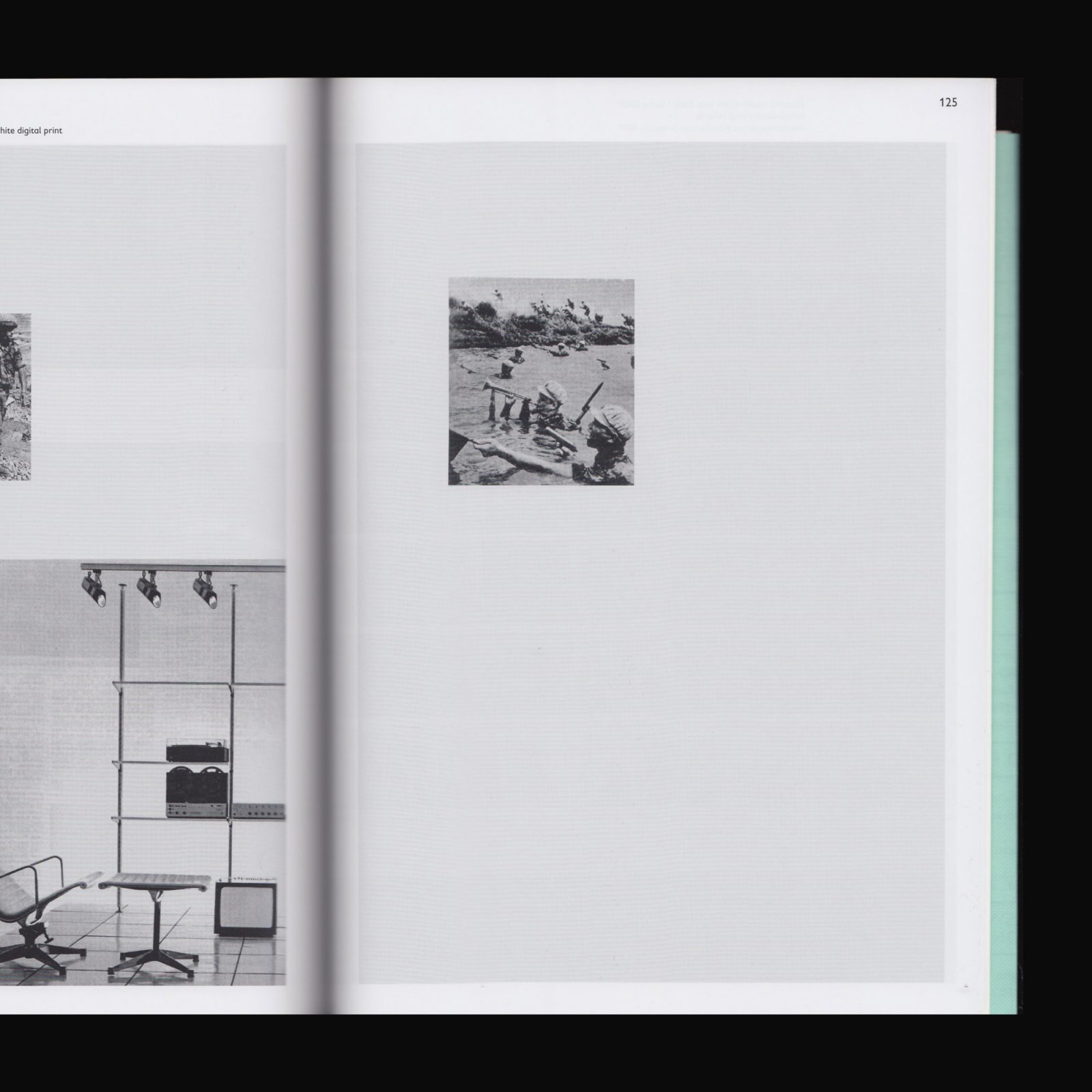
Produced on the occasion of the 2009 ars viva prize for fine arts. Mariana Castillo Deball, Jay Chung & Q Takeki Maeda, and Dani Gal examine historical fragments, documents, and objects in a new light. The artists take on the roles of amateur archaeologists as they work with found objects and fragments; even though it is clear that all display an obvious interest in historical objects, instead of providing any sort of conclusion regarding history as a whole they play an associative game, which formally resembles Aby Warburg’s Mnemosyne Atlas, while reflecting upon personal encounters with objects and places.
With texts by Jeronimo Voss, Cathy Lane, Raimundas Malasauskas, Christiane Mennicke-Schwarz.