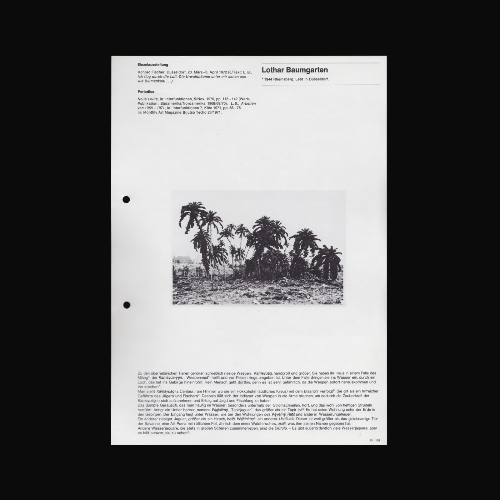
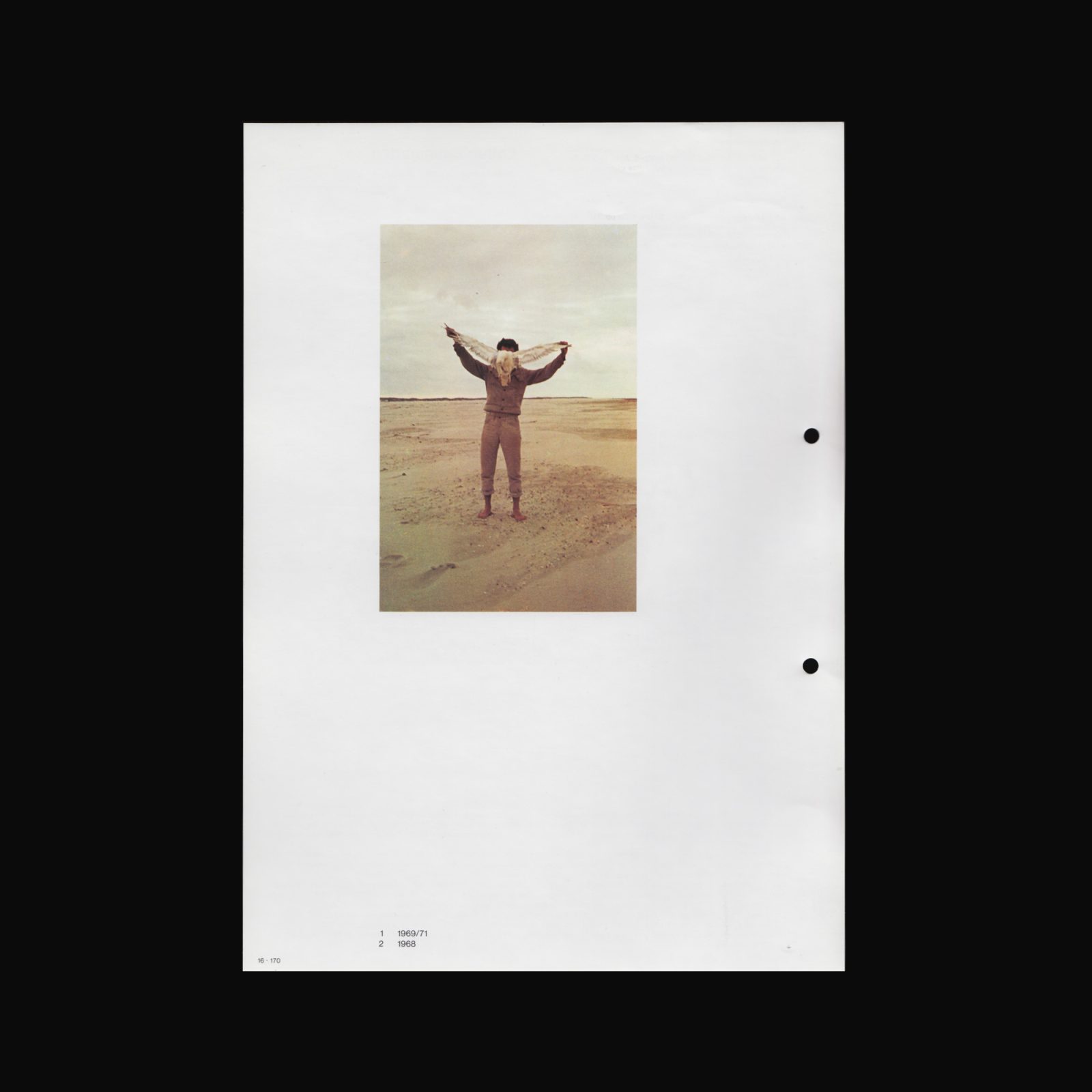
Artist book by stanley brouwn, produced by the Stedelijk Museum voor Actuele Kunst, Ghent in 2001.


Artist book by stanley brouwn, produced by the Stedelijk Museum voor Actuele Kunst, Ghent in 2001.

“Behind the standards put in place for the communication related to his exhibitions—the use of lowercase and Helvetica exclusively, the refusal to reproduce images of his work, to produce (or allow production of) written commentary on the subject of the same work, to appear in the context of a vernissage or even to answer an interview—the artist stanley brouwn builds his identity by way of ellipses. The invitation cards for his solo exhibitions provide a symptomatic example: set almost exclusively in Helvetica, the absence of uppercase, flying in the face of the graphic identity of the gallery or the host institution, they seem impossible to date, give or take twenty years”—Céline Chazalviel, Revue Faire –To look at things #4, 2017

“Behind the standards put in place for the communication related to his exhibitions—the use of lowercase and Helvetica exclusively, the refusal to reproduce images of his work, to produce (or allow production of) written commentary on the subject of the same work, to appear in the context of a vernissage or even to answer an interview—the artist stanley brouwn builds his identity by way of ellipses. The invitation cards for his solo exhibitions provide a symptomatic example: set almost exclusively in Helvetica, the absence of uppercase, flying in the face of the graphic identity of the gallery or the host institution, they seem impossible to date, give or take twenty years”—Céline Chazalviel, Revue Faire –To look at things #4, 2017

“Behind the standards put in place for the communication related to his exhibitions—the use of lowercase and Helvetica exclusively, the refusal to reproduce images of his work, to produce (or allow production of) written commentary on the subject of the same work, to appear in the context of a vernissage or even to answer an interview—the artist stanley brouwn builds his identity by way of ellipses. The invitation cards for his solo exhibitions provide a symptomatic example: set almost exclusively in Helvetica, the absence of uppercase, flying in the face of the graphic identity of the gallery or the host institution, they seem impossible to date, give or take twenty years”—Céline Chazalviel, Revue Faire –To look at things #4, 2017


Catalogue produced for Documenta 5, 30 June and 8 October 1972 in Kassel, Germany. The artistic director Harald Szeemann channeled many of the curatorial concepts for the exhibition into the design of the catalogue itself.
Including artists such as; Art & Language, Bernd & Hilla Becher, Hanne Darboven, Hans Haacke, Edward Kienholz, David Lamelas, Agnes Martin, Paul Thek, Franz Erhard Walther, La Monte Young, & Marian Zazeela, Richard Tuttle, Paul Sharits, Gustav Metzger, Mario Merz, Joan Jonas, Eva Hesse, Dan Graham, Joseph Cornell, Tony Conrad, Stan Brakhage, KP Brehmer, James Lee Byars, Daniel Buren, stanley brouwn, Lothar Baumgarten amongst others.
Cover designed by Ed Ruscha.


Produced on the occasion ofstanley brouwn: Mens Loopt op Planeet Aarde/Man Walking Planet Earth, at the Stedelijk Museum, Schiedam, 14 October, 2017–21 January, 2018.
“Where other artists give free rein to paint or pencil, stanley brouwn (1935-2017) opted for ‘distance’ and ‘measurement’ as media. His work is about directions and distances and how to move within that context. His first museological exhibition in the Stedelijk Museum Schiedam was in 1970. The exhibition Man Walking Planet Earth, close on half a century later, is a tribute to the artist who evolved into one of the most prominent conceptual artists in the world. He died in May 2017.”—exhibition press release